


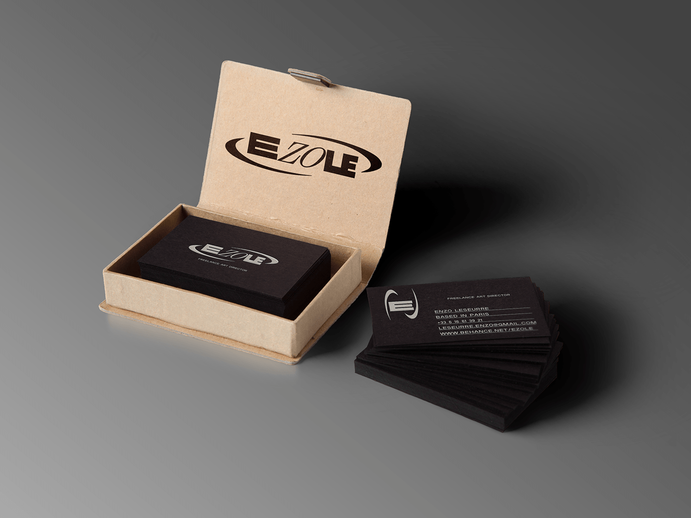
PERSONAL BRANDING - EZOLE
A little personal work, in aim to brand myself as a freelance art director, with a logo and its responsive versions.


This logo is kind of self explanatory for me, as I wanted to represent my style and my inspirations in graphic design. I wanted a really modern logo with a cinematic, elegant and fashion effect. The "Hanson" bold font helps to have this really strong aspect, almost cinematic. On the other hand, the secondary font called "Scotch Display", with serif, comes to equilibrate and bring contrast to the logo. I chose to separate the two fonts to make my surname "Zo" highlighted, as almost all my friends call me Zo. The circle and the italic font used here is to make look this logo really modern and stylish, with Y2K inspirations.


As the logo has 3 distinct syllables, with three different styles, I thought I could separate them and have three responsive logos, with all different meanings : the first one as it's the first letter of both of my name and pseudo, the second one as it's my surname and the last one as it's my initials.
Thanks ;)


